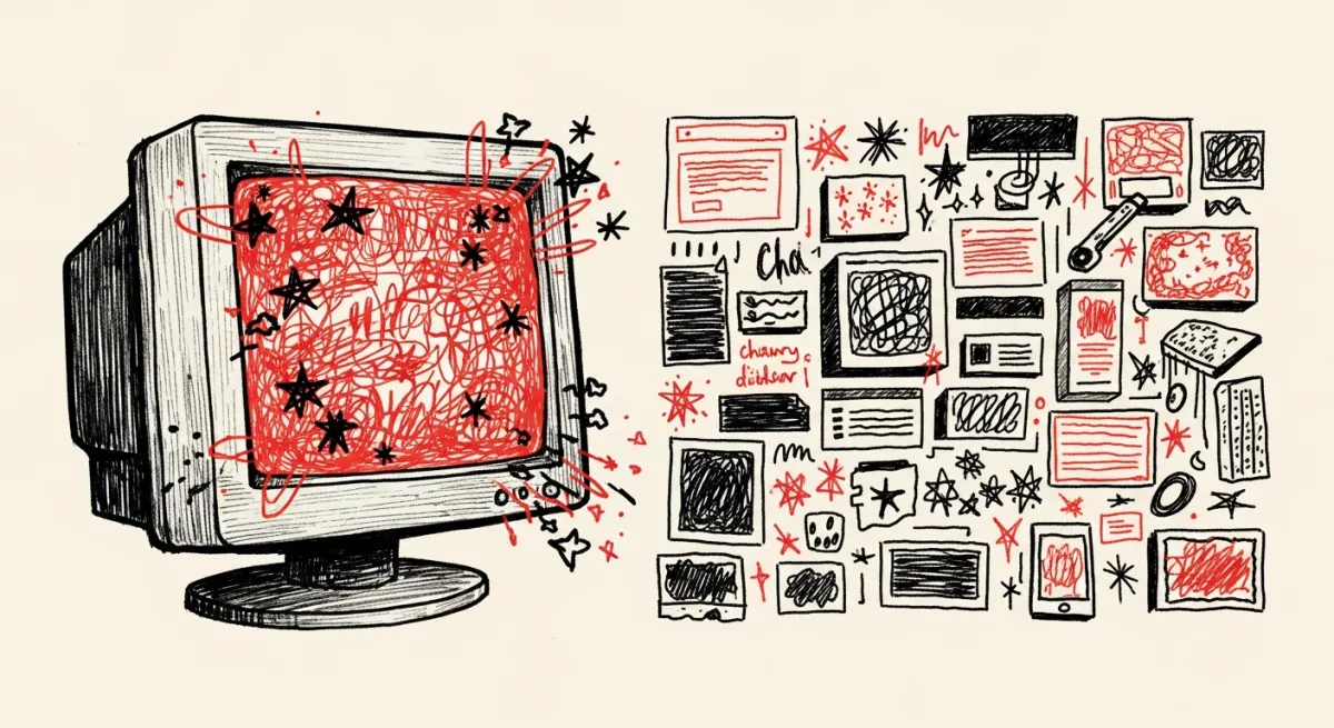
The last time I hand-wrote HTML, MySpace was the biggest website on the planet. I'm talking <marquee> tags, a background MIDI you couldn't turn off, and a "Top 8" that ended friendships. I built pages that were loud, broken, and unmistakably mine.
Then I stopped for about fifteen years. And when I came back to build this site, the entire design internet had agreed on one thing: everything should look the same.
Minimalist perfection is a costume
You know the look. Twelve-column grid. One accent color sampled from a Dribbble shot. A hero headline in a friendly sans-serif — "Empowering teams to do their best work" — floating over a stock photo of people laughing at a laptop. A cookie banner. A chat bubble. Ship it.
It's clean. It's professional. It's completely interchangeable. You could swap the logo on a hundred of these sites and nobody would notice. That's not a design language; it's camouflage.
And here's what bugs me about it: the polish is doing a job, and the job is hiding. A perfectly sanded surface tells you nothing about what's underneath. Sometimes there's a great business under there. Often there's a landing page, a Calendly link, and someone hoping you don't ask too many questions.
The tell. The more a small company's site looks like a Series-B fintech, the less it usually resembles the actual business you'd meet in person.
Scrappy reads as honest
The people I like working with — the plumber running his whole operation out of one spreadsheet, the warehouse that still faxes, the two-person shop drowning in manual data entry — do not trust the laughing-at-a-laptop website. They've been burned by it. Somebody sold them "digital transformation," took a retainer, and left them with a prettier version of the same mess.
What they trust is someone who looks like they actually do the work. Grease under the nails. A van with the company name hand-painted on the side. Someone who shows you the wiring instead of hiding it behind a panel.
So I asked a simple question: what does that look like as a website?
Not messy for the sake of it. Not a gimmick. A site that reads like a workshop instead of a showroom — monospace type like a terminal, hand-scrawled headlines, black and white with one stripe of red, and a skunk mascot who is visibly overwhelmed because that's the honest emotional state of anyone integrating two systems that hate each other. Unpolished. Effective. Real.
The bet. For the businesses I want to help, "looks a bit rough but clearly knows what it's doing" beats "flawless and forgettable" every time.
So I built it to look like what it is
This site is a terminal that got into a fight with a zine. The body font is IBM Plex Mono, so the whole thing reads like a console. The headlines are Permanent Marker, because a marker is what you actually reach for when you're explaining something on a whiteboard. There's a dark "blackboard" mode. The mascot is a skunk — not a mascot chosen by committee, a skunk, because skunkworks, and because it made me laugh.
None of it is an accident, and none of it is trying to look expensive. It's trying to look true. The design is the argument: I'm not here to sell you a transformation. I'm here to fix the thing that's broken, show you exactly what I did, and leave the panel off so you can watch it work.
Which raises the obvious question, given that I hadn't written a line of HTML since ringtones were a business model: how did a scrappy little site like this — with analytics, social cards, and a stack of blog posts — go from nothing to live in two weekends?
That's the next post.
Takeaways
- Minimalist "perfection" is often camouflage. A flawless surface hides what's underneath, and buyers who've been burned know it.
- Match the aesthetic to the customer. The businesses I serve trust "clearly does the work" over "clearly hired an agency."
- Design is an argument, not decoration. Every choice here — mono type, marker headlines, the skunk — says the same thing the business does.
- Rough on purpose isn't careless. It still has to load fast, rank, and work. Scrappy is a style, not an excuse.
Next: Two Weekends, an AI Crew, and a Used Gaming Rig — how the thing actually got built.